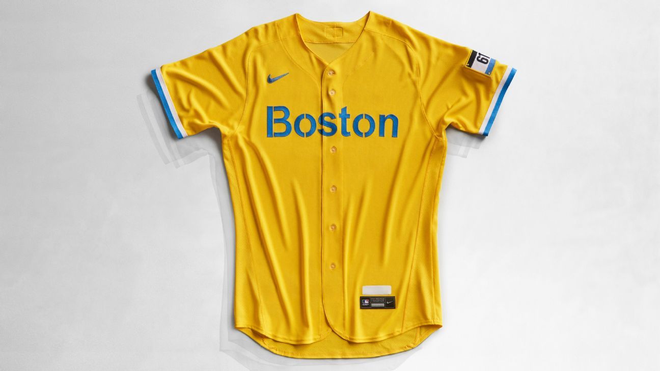
The Boston Red Sox, known for its traditional white uniforms with red letters and the iconic “B”, is revealing its first shirt without any red.
As part of Major League Baseball’s first collaboration with Nike – which became the sport’s uniform supplier in 2019 – the Red Sox unveiled the yellow and light blue uniforms on Tuesday.
Inspired by the Patriots Day holiday and the Boston Marathon, the t-shirts feature a 617 marathon bib patch, Fenway Park area code, on the left sleeve.
MLB’s radical design is part of Nike’s first venture into designing alternatives to baseball, known as the City Connect series, designed to push the boundaries of uniform design.
“It was in the front and in the center and that’s why we closed this deal. You take two iconic brands and put them together and you have one and one, three,” said MLB chief revenue officer Noah Garden. “This is what we expected and this is what we wanted. This is the plan that we have always drawn up.”
The City Connect series will start with seven teams with scattered release dates: Red Sox, Miami Marlins (May 21), Chicago White Sox (June 5), Chicago Cubs (June 12), Arizona Diamondbacks (June 18), San Francisco Giants (July 9) and Los Angeles Dodgers (late August).
Each MLB team is expected to have a City Connect shirt by the end of the 2023 season, with teams working individually with Nike to create a uniform connected to the personality and community of each city.
Since taking over as a uniform supplier for the NFL and NBA, Nike has been pushing for radical design changes to similar uniforms in baseball, with City Edition uniforms in the NFL and NBA creating a wide variety of looks. Nike introduced 10 different concepts to Boston in early 2019, with Red Sox marketing director Adam Grossman and executive vice president Troup Parkinson coming to the Patriot Day concept.
Grossman said that when the Red Sox learned of the sport’s partnership with Nike two years ago, they contacted each other to say they wanted to push the boundaries in terms of uniform design.
“We wanted to be at the front of the line. We told them that we would love to collaborate in any way you think,” said Grossman. “That was two years ago, and at that point, they said they were going to do the City Connect program that, if we are going to do that, we will be all-in and, although we are a traditional historic franchise, we want to do something completely different.
“We want to go further and be bold about it.”
Although Grossman initially hesitated to reveal a Red Sox shirt without the color in the team’s name, he felt the connection to Patriots Day and the marathon presenting a unique narrative that justified the decision to move forward with a bold design. The Red Sox will wear the yellow and blue uniforms for the first time on April 17 and 18 against the White Sox before wearing their traditional Patriot Day uniform with the Boston Strong emblem first revealed after the Boston Marathon attacks in 2013.
“This was the one we felt from the beginning that it was this one, but it was also like, ‘This is a Red Sox shirt that has no red or anything on it,'” Grossman said. “We wondered if we could do this and it felt like it was time to do that. There is never a better time than now. It pushes us as an organization, it pushes baseball and I think that the way we’re launching, we think would allow us to get into different Boston neighborhoods that are promoting culture in Boston, because that’s part of what it reflects. “
Nike senior designer Wil Green said Nike found inspiration at the finish line of the marathon when designing the uniforms, which feature a stencil-like font on the front of the shirt.
Grossman acknowledged that many baseball traditionalists may not like the great departure from the team’s traditional shirts, but they are also not aimed at the “traditionalist”.
“We understand that for traditionalists this may not work for them and we are OK with that,” said Grossman. “We understand. It’s not about replacing our spotless whites. That’s not what it’s about, but it’s about connecting and making other people look at us differently, especially younger and more diverse groups. We embrace that, and it’s it’s important to recognize and celebrate that, and that’s what it represents. “
The launch of the City Connect series is in line with MLB’s strategy in recent years to expand baseball logos to trendy streetwear. Garden said the City Connect series is an attempt by MLB and Nike to bring baseball uniforms to the fashion world.
Grossman said the City Connect series offers baseball an opportunity to increase its audience among casual fans and become part of the daily lifestyle culture.
“When you see this convergence and for us and for the sport, we want to be more part of the lifestyle,” said Grossman. “We do it as a game, but getting out of the white lines of the diamond, that goods and hats are part of everyday culture, is essential for the growth of the game, as well as the game itself.”
With baseball entering the third season of a 10-year contract with Nike as a uniform supplier, Grossman hopes the City Connect series will be the beginning of a series of changes to the design of the baseball uniform.
“We are going to see more experimentation not just with colorways, but I think that as we enter this relationship as an industry, the creativity around the design itself will be something that will be interesting to see,” said Grossman.
