
Google is emailing the annual map timeline update now and is a sad reminder of all the places you were unable to visit thanks to COVID. To be clear, it does show all the places you’ve visited this year, but you’ll notice that, compared to last year, your timeline probably looks very short.
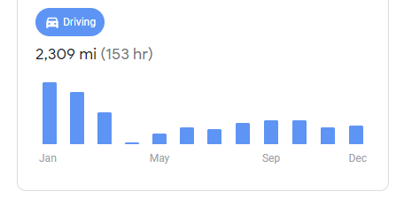
You can see in the email how many cities and places you visited and even what types of locations they were in. My most visited places were marked with shopping and food and drink, but this is no surprise to anyone, right? Another section compiles how much time and distance you have walked and driven a vehicle each month of the year. Most people will notice that January and February, and perhaps part of March, are high, while the rest of the year just falls on the graph, thanks to requests to stay at home and the work of local culture.
The highlights of the main cities and places visited also fill the body of the email, but this is nothing special. What’s really cool is that Google Maps has calculated the percentage of the world you’ve traveled. Apparently, I only saw 9% of planet Earth – as if I wasn’t depressed enough to wait until I was 30 to travel, Google gave me a reminder.
To be fair, the top of the email states that the Maps timeline update is generated and published automatically and they recognize that COVID-19 has prevented everyone from fulfilling their dreams of seeing the world (in more or less words) . As long as the rest of this year is nothing like the last 9 days, I would say that there is still hope – we’ll see, right?

