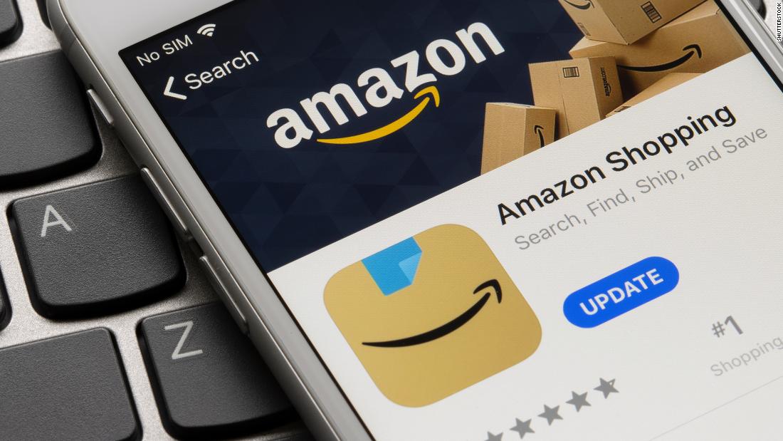
Users of the Amazon Shopping app will now see a brown box that looks like a package with a blue strip that looks like the packaging tape above the company’s signature arrow in the shape of a smile.
Amazon introduced the new initial icon in a handful of international markets in late January, but has now changed the design of the blue ribbon after some said it looked like a toothbrush-style mustache, similar to the one worn by Adolf Hitler.
“I completely missed that Amazon silently adjusted its new icon to make it … less like Hitler,” wrote Alex Hern, technology editor for Guardian on Twitter.
The new icon, the first design change in over five years, replaces shopping cart and dispenses with the word “Amazon”, but displays the company’s smiley arrow logo more prominently. The blue tape looks like it’s being pulled off, as if opening the package.
“We designed the new icon to arouse expectation, excitement and joy when customers begin their shopping journey on their phones, just as they do when they see our boxes at their door,” said an Amazon spokesman. The application icon was adjusted based on user feedback.
Only iOS users in the UK, Spain, Italy and the Netherlands have seen the Hitler logo in recent weeks. The updated logo launched worldwide for iOS users last week. Android users will see the new logo starting this week.
